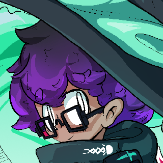
Witch, still trying to put their thoughts together.
Small VNs, bits of art, blogs I call blebs.
1-Oct-26: Thursday Bleb 2

October already, while barely remembering what happened in September really is a mood. Though, suppose that's also why I'm doing these blebs now, so. Unfortunately, this week was also barely remembered since good grief is it's been a weird mix of humid and rainy and that annoying uncomfortable heat, leaving me largely in a malaise for most of it. Not much else happening anyways; major Deadlock update which I love for the designs and art of the map but, I really cannot bring myself to pick up a MOBA after all these years. Also visited the Big Japanese Supermarket & other supermarkets in the area, but that wasn't much except for grocery shopping and buying a bunch of autumn-related teas and snacks.
Was thinking a bit on art after this day's Bakatako (it's a daily art-prompt sorta-social media thing), though. Namely that I only really felt the image came together by slapping on a orange color burn filter over everything? It felt a bit cheap, one of those shortcuts you're meant to avoid with art and such, something where I should probably learn colors more rather than using A Filter.
But also like. Half my art is already a bunch of shortcuts and ease of learning stuff stacked on top of each other. When I started learning art I just hated the way I tried to render out eyes, getting them similar to the model reference I was using. Making them big and stylized as they kind of are now was the only way I could stomach looking at my own art without cringing at the quality. Same with the hands, shadows... I would say 'who cares' but I care but also I'm excessively self-critical of my own art so I can probably afford to be a bit softer on it all.
Also think that being able to just Filter Things is part in parcel about being a digital artist. Gurney's Color and Light has a lot of discussion and topic on the medium of paint, canvas, and how color physically interacts with each other, and how certain color spaces are just from the mundane situation of "you only brought like three tubes of paint to your plein air". In the same way, a lot of Digital Art things feel like stylistic shortcuts (to me at least) are really just, part of digital art. Putting a noise filter over things, aberrations and blur, large-swath gradients, even my beloved thing of using (quantizied) photographs as backgrounds. They can be used to shore up shortcomings, but also are just a style in-of-themselves.
There are still things I definitely need to improve with in art, my poses are still stiff and I still rarely do interesting foreshortened camera angles... But also like, why not have fun with it as well? Why not have nice gradient mapping and color burn and chromatic aberration? It looks nice and a lot of the styles I'm inspired by use a lot of those techniques, so...
(The boring answer is it balloons image size and social media tends to compress the image like hell and Discord only has so big of a file size that I sometimes reach because I usually draw at like 4000x4000px. But, still, I should probably have some more fun with it.)